Executives do not need another wall of charts. They need a single, reliable view that turns calendar and meeting noise into decisions. An executive meeting dashboard exists to answer three questions quickly: where is time going and what is it costing, are decisions unblocked, and does the meeting schedule leave enough room for deep work.
The reason is simple. Meeting time keeps expanding, often outside normal hours. Microsoft’s Work Trend Index reports meetings that start after 8 p.m. are up 16 percent year over year, a sign that fragmented schedules are pushing collaboration into the evening.
This article looks deeper into executive meeting dashboards, which KPIs belong on it, how it improves meeting culture, and impact on finances.

What is an Executive Meeting Dashboard?
An executive meeting dashboard is a high-level view of meeting health, decision flow, and time cost. It is built from calendar and meeting metadata that your tools already generate, not from activity monitoring.
The goal is an intentionally small, stable set of tiles an executive can scan in under two minutes during weekly or monthly reviews. Best-practice dashboard guidance consistently favors clarity and a limited metric set so the view becomes a habit instead of a curiosity.
In practice this means your meeting dashboard lives on top of Google Calendar or Outlook plus conferencing platforms, and it summarizes patterns that executives can actually act on: meeting load, timing distribution, focus time availability, agenda hygiene, punctuality, attendance integrity, and estimated cost.
What KPIs are Important for an Exec Meeting Dashboard
An executive dashboard is only as useful as the decisions it enables. The right KPIs turn data into direction; the wrong ones add clutter. The metrics below are those metrics to anchor executive conversations in measurable, actionable insight.
Meeting load
Load is the simplest signal of saturation and a baseline for any change. Flowtrace’s meeting analytics surfaces meeting frequency and duration as first-class metrics and lets you slice by team or function.
Decision it enables: Reduce or compress specific series that dominate time.
Timing and weekday distribution
Even a normal total of meeting hours creates fragmentation if the timing destroys contiguous work windows. Flowtrace’s dashboard presents time-of-day and weekday patterns so executives can refactor calendars, not just count hours.
Decision it enables: Move or consolidate clusters that repeatedly cut through prime focus hours.
Focus time availability
Important work needs uninterrupted spans. Flowtrace explains how to track and improve focus time so teams can deliver meaningful work faster.
Decision it enables: Adjust meeting cadence and cluster placement to restore usable blocks.
Agenda presence
Missing agendas correlate with overrun risk and follow-up chains. Flowtrace calls out agenda hygiene as a reliable signal of meeting quality and a lever to prevent spillovers.
Decision it enables: Enforce agenda rules on high-cost or decision-heavy series.
Punctuality and start-time delays
Late starts push into adjacent slots, collapsing planned focus blocks and triggering extra sessions. Flowtrace tracks punctuality as part of its meeting quality view.
Decision it enables: Shorten or cancel serial offenders and tighten moderator norms.
Acceptance and attendance patterns
Spectator-heavy rooms waste live time and reduce the capacity for deep work. Flowtrace highlights invite fit and attendance consistency so you can right-size rooms.
Decision it enables: Trim attendee lists, convert spectators to async summaries, and clarify who is truly required.
Estimated meeting cost
Break costs by function and top recurring series using transparent role-based rates. Costs are visible in dashboards and directly inside calendars through Flowtrace’s Outlook add-in and Google Calendar extension.
.png?width=1366&height=768&name=Outlook%20Add%20In%20Store%20Images%20-%201%20(1).png)
Decision it enables: Merge, shorten, or move high-cost sessions and replace low-intent meetings with async updates.
How an Executive Meeting Dashboard Improves Meeting Culture
The right executive dashboard changes habits without slogans. When preparation, timing, and attendance integrity are visible every week, teams self-correct.
Preparation becomes normal
When agenda presence appears as a visible metric, organizers show up ready. Agenda hygiene is one of the simplest ways to prevent overruns, and the cascade of follow-up meetings they create. Over time, compliance turns into muscle memory because everyone can see the signal, not because a policy demanded it.
Punctuality protects focus time.
Starting on time isn’t just courtesy; it’s how you preserve the focus windows that sit on either side of meetings. Tracking start-time delays across a series gives leaders data to shorten or retire sessions that consistently overrun.
Rooms get right-sized.
Attendance and acceptance data reveal when optional participants are pulled in by default or when no-shows indicate low value. Visibility makes it easy to move spectators to written summaries, protect their deep work, and still keep them informed.
From “more time” to “better time.”
The dashboard reframes success. The goal isn’t a blanket “no-meeting day”, it’s a healthier balance between decision-ready live time and protected focus time. That shift reduces ad hoc calls and evening spillover. Microsoft’s research on evening meetings underscores why this matters for well-being and sustainable productivity.
How it Improves Company Finances Through Meeting Cost Savings
A cost-aware dashboard turns small frictions into measurable savings. By making meeting economics visible, it converts hidden time drains into actionable opportunities for efficiency.

Expose high-cost recurring series
Sorting meetings by estimated cost highlights sessions that consume disproportionate senior time. When cost visibility lives inside the calendar itself, where meetings are created, cancellation, compression, or conversion to async becomes a practical decision, not an afterthought.
Prevent overruns and cascades
Agenda and punctuality hygiene prevent spillovers and the serial follow-ups they trigger. Savings multiply because you avoid both the meeting that ran over and the one it would have caused. These are operational fixes with financial impact, not policy for its own sake.
Protect peak-value hours
Timing and weekday distribution data reveal midday clusters that fracture productive time. Shifting a few heavy recurring sessions out of prime focus windows frees high-value hours, reducing after-hours work and the hidden costs of evening meetings and messages.
Put costs where people plan
When cost estimates appear directly in calendar views and meeting creation flows, every invite becomes a budget decision. Embedding these insights at the point of planning aligns organizer behavior with executive financial targets before the waste occurs.
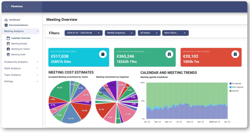
Flowtrace Executive Meeting Dashboard
Flowtrace provides essential meeting and calendar analytics for a complete executive meeting dashboard. It translates everyday collaboration data into insight, showing how time, cost, and participation shape the company’s meeting culture.
.png?width=960&height=540&name=Marketing%20Images%20(11).png)
Executives gain a clear, data-backed view of meeting culture, efficiency, and focus protection across the organization. Metrics include:
Meeting Analytics overview
At a glance you see meeting frequency and duration, cost exposure, attendance patterns, and engagement across Google and Outlook calendars plus conferencing integrations. This is the home for executive tiles such as meeting load, cost, agenda, punctuality, and acceptance consistency, with the ability to drill down to specific series.
Timing and weekday distribution
Meeting analytics highlight when meetings occur through the week and during the day. That surface helps identify back-to-back density and midday clusters that executives can move or compress to open up real focus time.
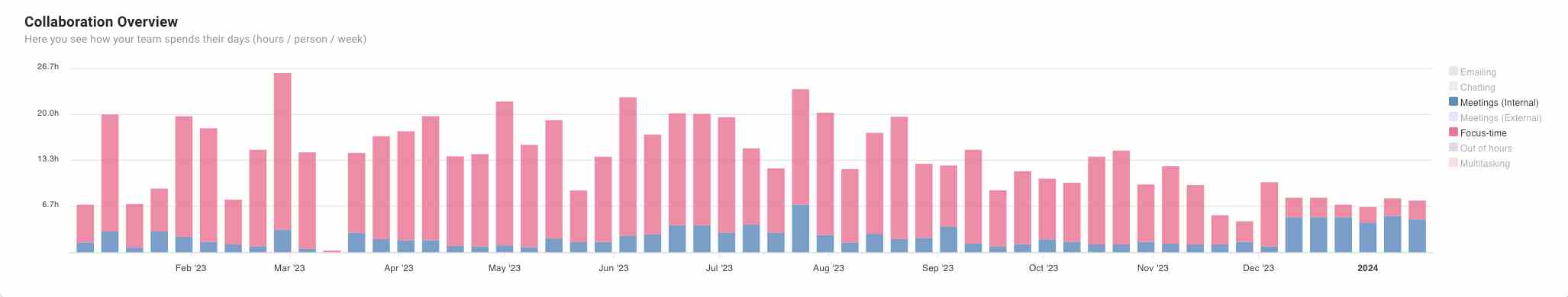
Focus time tracking
Flowtrace explains how to track focus-time availability and set realistic targets. In practice executives watch the focus-time trend alongside changes in load and timing to validate that calendar refactors are creating uninterrupted blocks.
Agenda presence and punctuality
Flowtrace explicitly tracks agendas on invites and start-time delays. These two signals are reliable leading indicators of overrun risk and unnecessary follow-ups, and they directly protect focus windows.
Acceptance and attendance signals
Executives can see acceptance, declines, and no-shows, plus “invite fit” patterns that indicate spectator-heavy rooms. That makes right-sizing invites a quick win that frees material amounts of live time.
Estimated meeting cost
Flowtrace’s Outlook add-in and Google Calendar Chrome extension bring cost transparency directly into the calendar. Admins can manage role-based rates centrally; organizers see cost as they plan and edit invites.
Get a Complete Overview of Your Meeting Culture
An executive meeting dashboard isn’t another KPI board, it’s a decision surface. It shows where time goes, what it costs, whether meetings produce outcomes, and whether the calendar still leaves room for deep work.
Keep the metric set focused on the vital few. Define them once, hold the line, and review them on a predictable cadence. The most effective dashboards track four levers: high-cost recurring series, agenda and punctuality hygiene, right-sized attendance, and timing clusters that can be repaired.
When those levers move together, culture shifts on its own. Preparation improves. Meetings start on time. Spectator seats empty. The financial results follow, fewer bloated series, less overrun waste, and more reclaimed focus hours that prevent evening spillover.
Flowtrace delivers these insights directly from calendar reality and embeds cost awareness where it matters most, inside the event composer. That’s how improvement begins before the invite is even sent.
Frequently Asked Questions - Executive Meeting Dashboard